As the cost of living in large cities continues to rise, more and more people are realizing that the value of a dollar in the United States is a very relative concept. For decades, cost of living indices have sought to address and benchmark the inconsistencies in what money will buy, but they are often so specific as to prevent a holistic picture or the ability to “browse” the data based on geographic location.
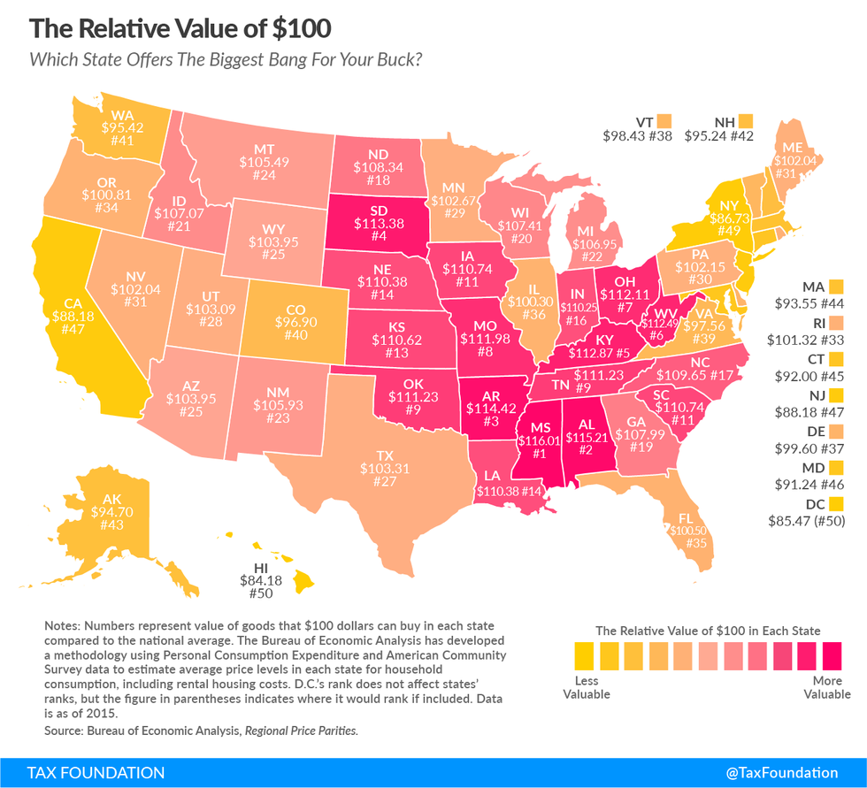
The Tax Foundation addressed many of these shortcomings using the most recent (2015) Bureau of Economic Analysis data to provide a familiar map of the United States overlaid with the relative value of what $100 is “worth” in each state. Granted, going state-by-state still introduces a fair amount of “smoothing” into the process — $100 will go farther in Los Angeles than in Fresno, for instance — but it does provide insight into where the value lies.
The map may not subvert one’s intuitive assumptions, but it nonetheless quantities and presents the cost of living by geography in a brilliantly simple way. For instance, if you’re looking for a beach lifestyle but don’t want to pay California prices, try Florida, which is about as close to “average” — in terms of purchasing power, anyway — as any state in the Union. If you happen to find yourself in a “Brewster’s Millions”-type situation, head to Hawaii, D.C., or New York. You’ll burn through your money in no time.

If you’re quite fond of your cash and would prefer to keep it, get to Mississippi, which boasts a 16.1% premium on your cash from the national average.
The Tax Foundation notes that if you’re using this map for a practical purpose, bear in mind that incomes also tend to rise in similar fashion, so one could safely assume that wages in these states are roughly inverse to the purchasing power $100 represents.
This article originally appeared on 08.17.17
