
The NBA and Nike officially unveiled the 2024-25 City Edition uniforms for all 30 teams on Thursday, and while the designs have been leaked since this summer, I like to wait until we get the official images to rank them. That is because the actual jerseys themselves almost always look better than their 2D mock-ups, which is certainly the case with this year’s crop. The leaks got roasted to no end on social media and while I’m not crazy about this year’s group of uniforms, they aren’t as bad in actuality as the leaks looked.
That said, there are some heaters and some really bad ones, along with a big crop this year of very “meh” looks as it’s fair to wonder if Nike and the teams are running a bit short on ideas — good news guys, at least another 12 years of these! Here we are ranking the uniforms from worst to best, where there’s one that should become part of one team’s permanent look.
You’re Better Than This
30. Boston Celtics
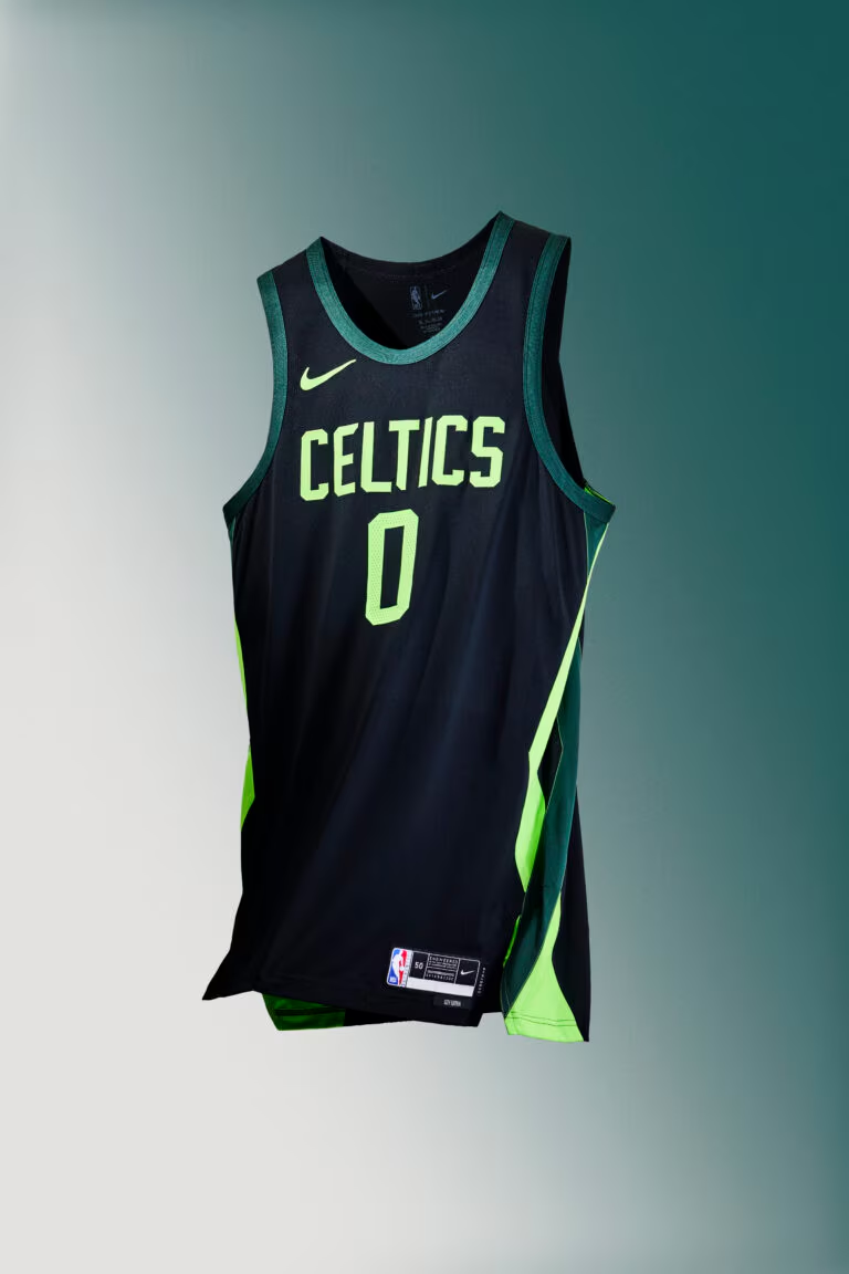
Creating good alternates is hard when you have an iconic jersey set, and that’s the problem the Celtics (and Lakers) run into every year. These are just bad and don’t even seem to be trying to do anything interesting. Wear your normal (and great) uniforms, please.
29. Los Angeles Lakers
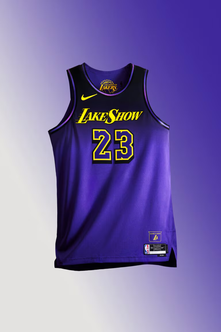
Same goes for the Lakers. These are just unbecoming of a once proud franchise.
Tried Something, Just Not For Me
28. Miami Heat

I’m honestly kind of stunned they went back to the Heat Culture well again after the reaction to when they did this last year, but it does look a little better on the all red uniform. Still, c’mon guys, stop trying to make this a thing.
27. Oklahoma City Thunder
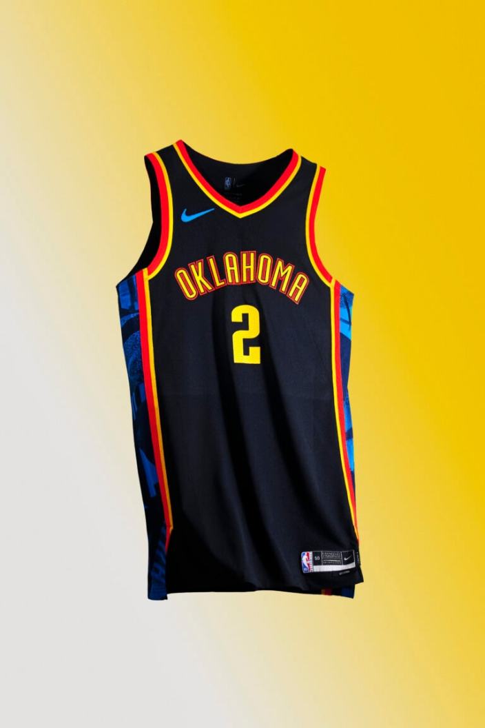
On the opposite end of the spectrum from Boston and L.A. is OKC, which has had one uniform in its history that I thought was legitimately good (the 2018 City Edition honoring Oklahoma’s Native American heritage). Everything else has been either “meh” or outright bad. I’ll say this, these aren’t the worst unis they’ve ever had, but I just am not a fan.
26. Indianapolis Pacers
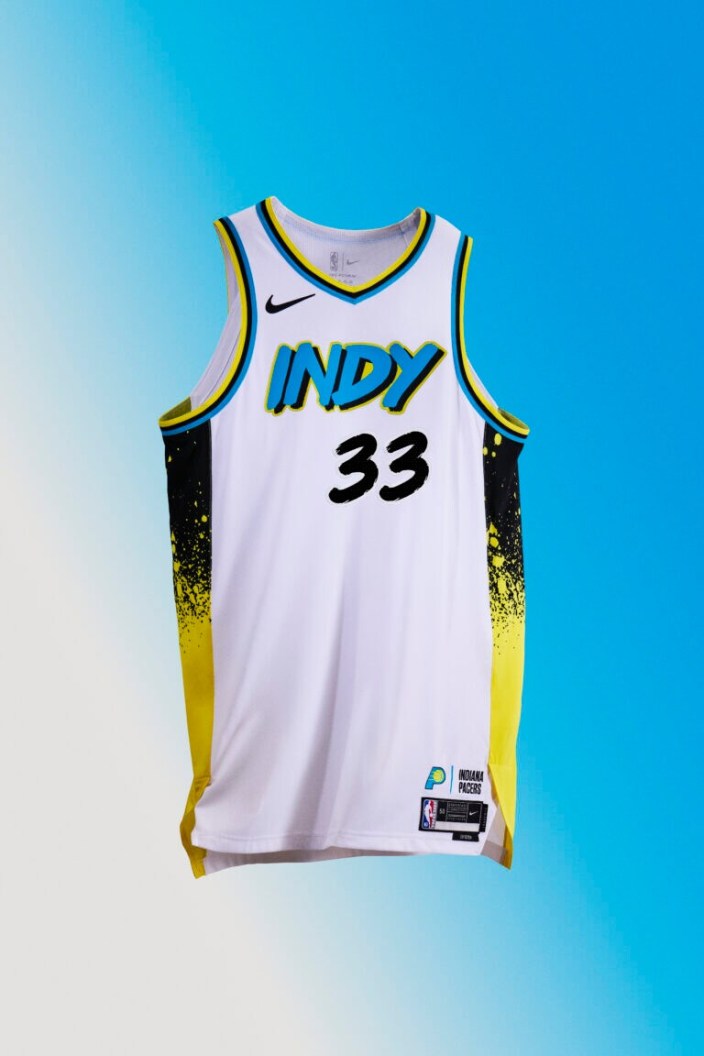
The Pacers have done this look before in black, and it’s just not for me.
25. Atlanta Hawks

A retro look that just doesn’t really land for me. I will say, I bet the court they have for this color scheme will look great, but I’m just not a big fan of the lettering.
24. Brooklyn Nets
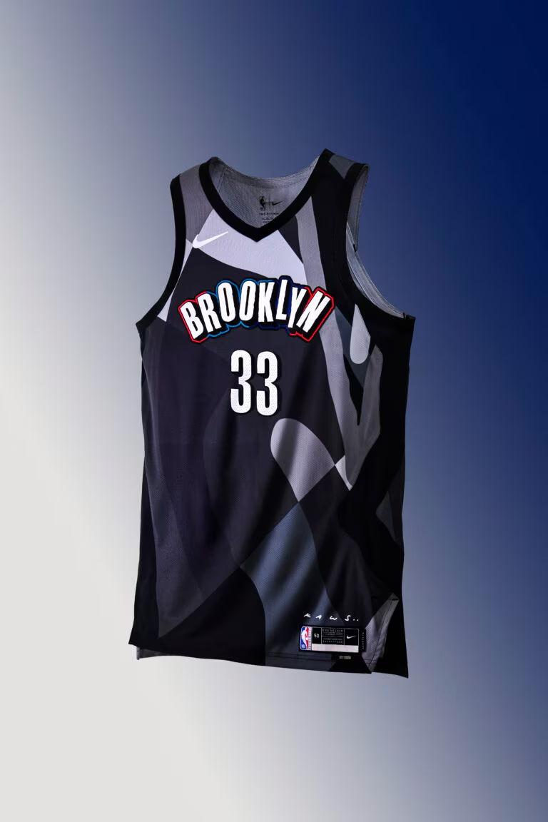
I wouldn’t call these bad, they just don’t land for me, but that’s also been the case for a number of the Brooklyn City Editions over the years.
23. Denver Nuggets
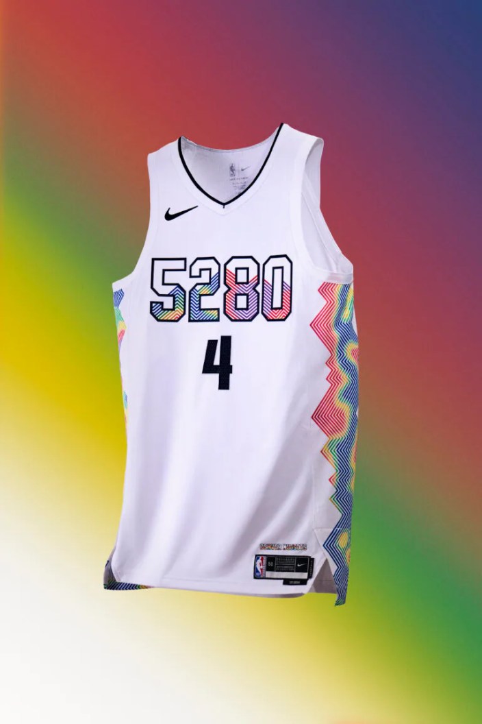
I’m just out on the 5280 thing. I like the mountains on the side and the topographical map thing, and while I think there are better executions, leaning into the rainbow coloring is generally good for Denver. However, I just can’t get on board with the 5280 in place of lettering.
White Jerseys With No Real Juice
22. Dallas Mavericks
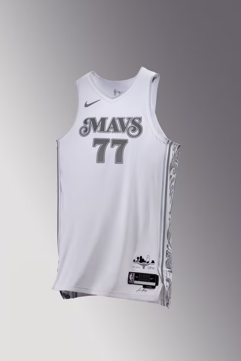
All of the uniforms in this tier have the same issue of not being bad, but also not being particularly inspiring. Dallas’ are particularly plain, which, again, not necessarily bad, but not memorable either.
21. Chicago Bulls
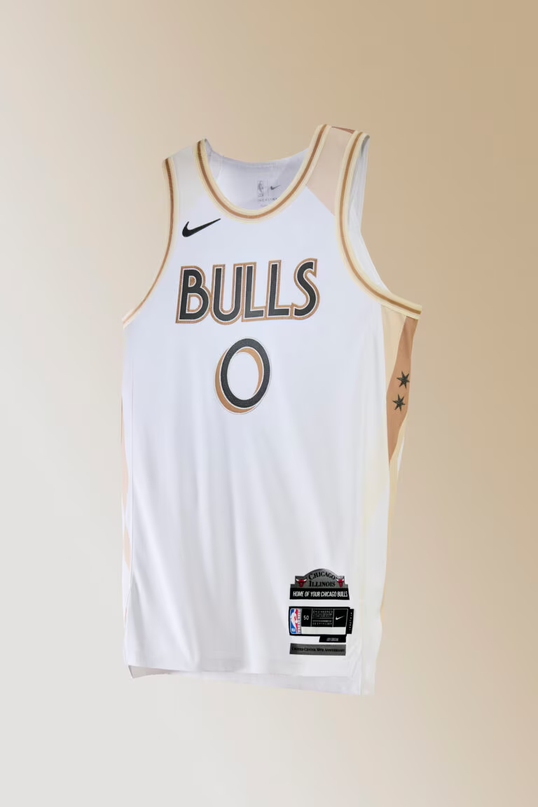
I get they’re going for the Chicago musical font here, but it feels like they weren’t willing to go all-in on it and the end result is pretty bland.
20. Minnesota Timberwolves
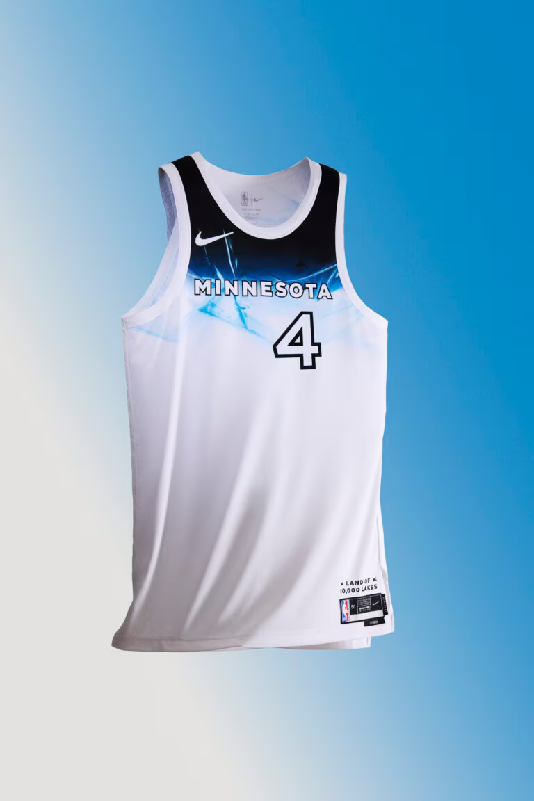
I get what Minnesota’s going for, but I just see an old Windows 98 screensaver in that design.
19. New York Knicks

They aren’t as bad as the Lakers and Celtics, but they also have a similar problem where their normal uniforms are iconic classics and trying something new often just makes you want them to do what they always do.
18. Orlando Magic
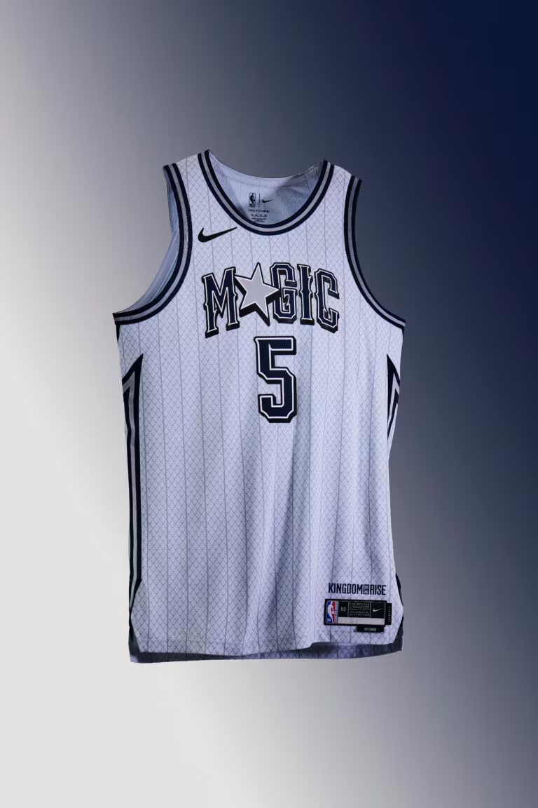
The Magic are at the top of this group by virtue of having the best lettering/logo — the Magic with a star for the A is always great — but Orlando has great uniform looks and this one just falls flat comparatively.
Colorful Jerseys With No Real Juice
17. Charlotte Hornets

Like Orlando, Charlotte has some great throwback looks and this just makes me wish they were wearing one of those instead.
16. Los Angeles Clippers
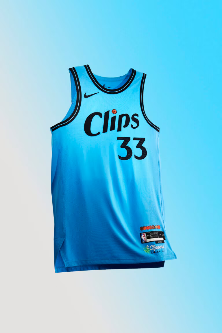
My colleague Mark said the logo looks like it should be for store brand paper towels and I can’t unsee it. I do like that shade of blue though.
15. Milwaukee Bucks

Perfectly fine, even though it’s still a little confusing when the Bucks are wearing all-blue.
Pandering To Your Star Player By Remaking His College Jersey
14. Detroit Pistons
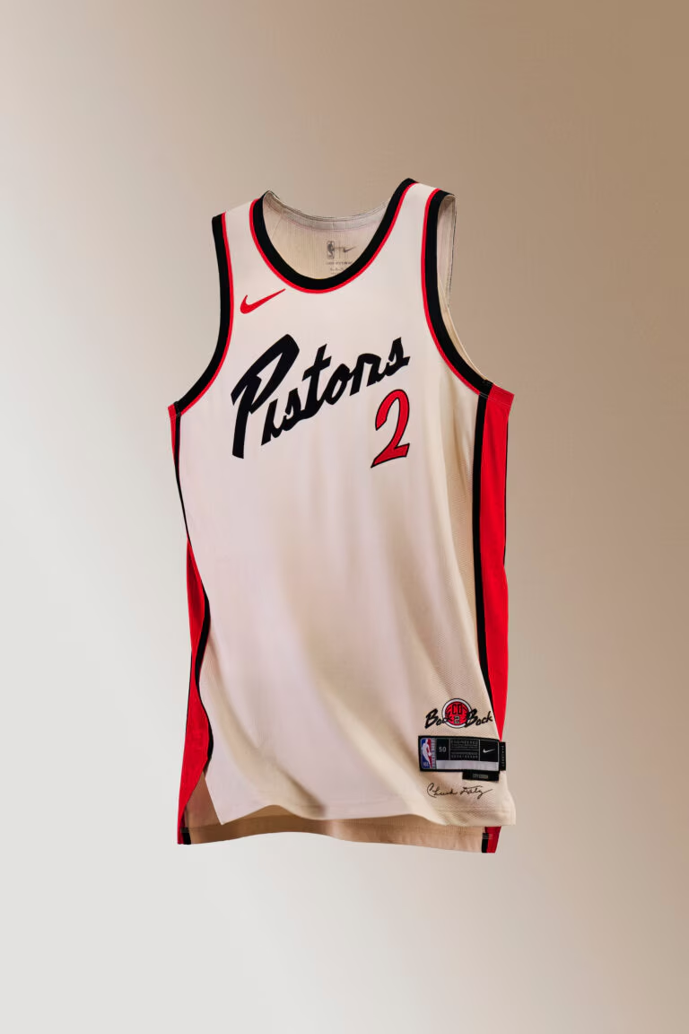
Never seen a more Oklahoma State jersey in my life. Go Pokes.
Jersey From A Basketball Movie That Couldn’t Get NBA Licensing
13. Houston Rockets

I actually kinda like these, but they are giving off strong vibes of made up Houston jerseys for a movie that couldn’t afford NBA licensing.
Good Efforts At Taking A Swing
12. New Orleans Pelicans
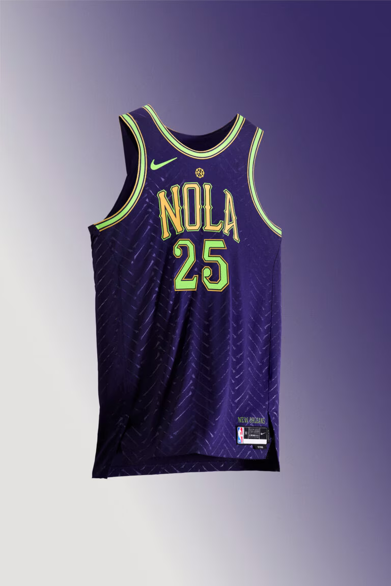
If I were to guess, these will be among the most polarizing unis. I dig New Orleans leaning into being a little different and weird, and the herringbone pattern with actual bones certainly does that. They will likely be at the bottom of some folks rankings but I don’t think their standard unis are so good that they can’t get weird and have it work.
11. Golden State Warriors
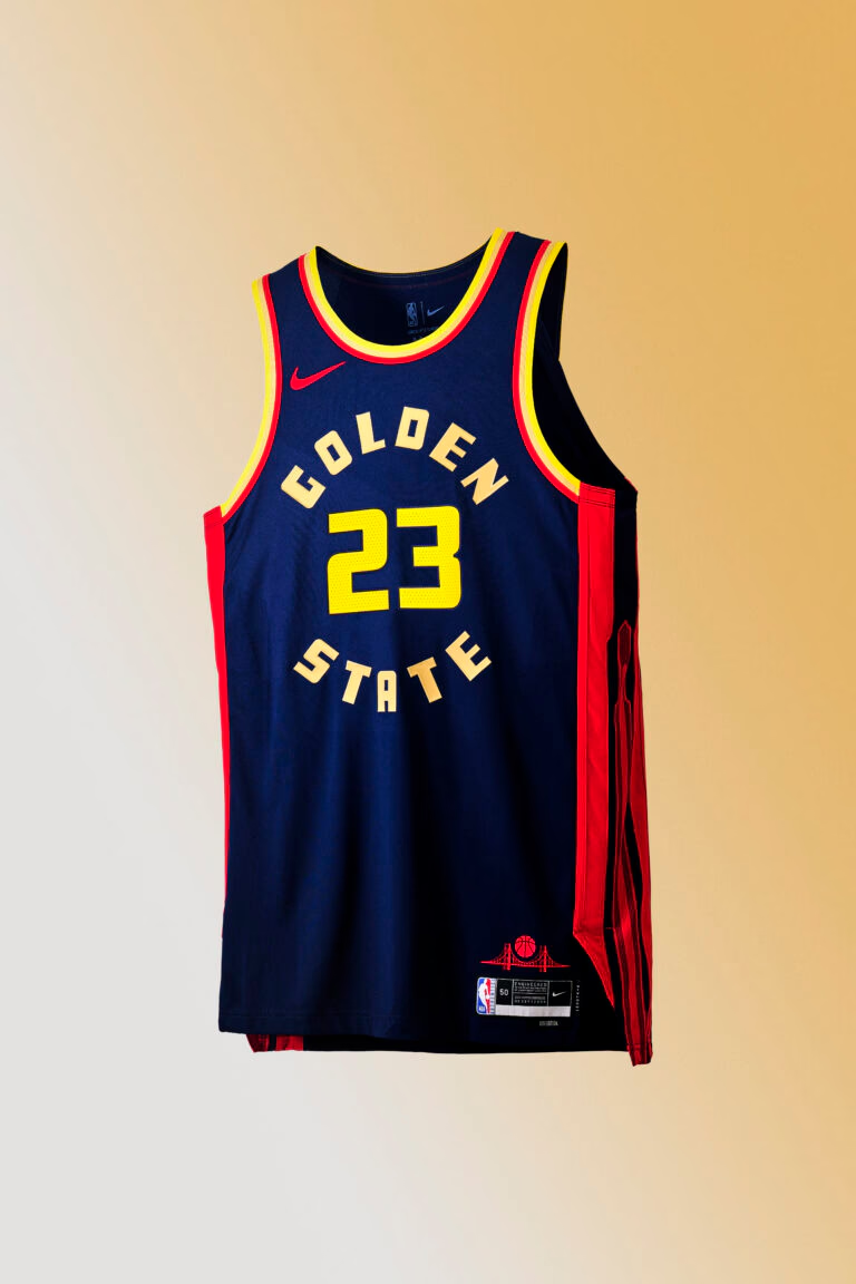
These have grown on me a bit, in part because they at least look like Warriors uniforms — unlike their Michigan/Marquette alternates from a year or two ago. They aren’t the best uniforms in the world, but a solid attempt at playing off something unique to the Bay (the Golden Gate Bridge).
10. Washington Wizards
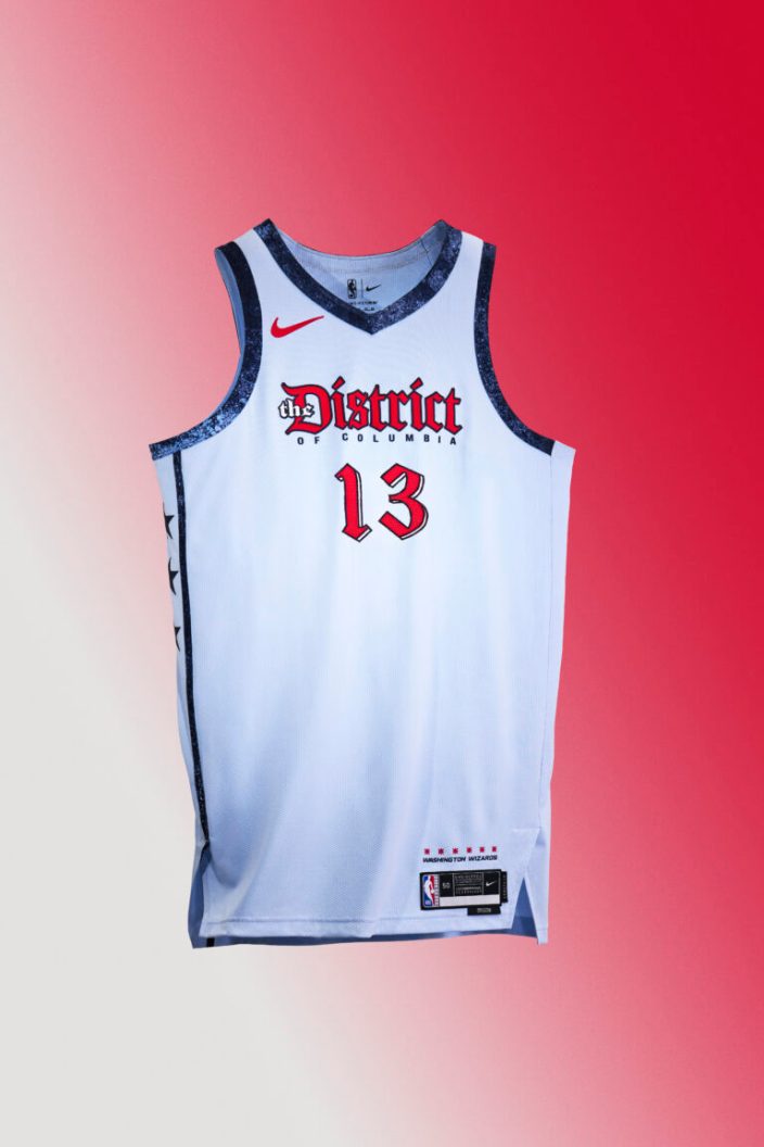
I really like the District font and this year they put it on a nice color instead of whatever the hell the black and green and orange thing was a year ago. The Wizards won’t be good this year, but I do think they’ll look good in these.
9. San Antonio Spurs
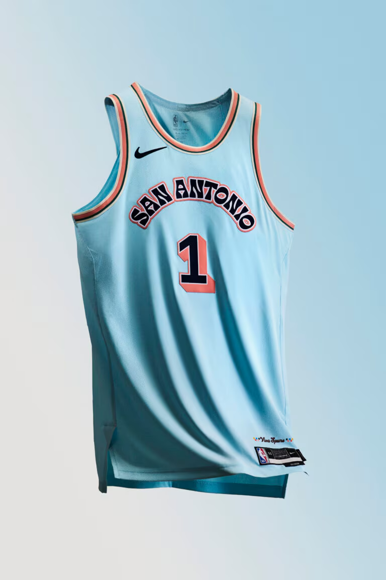
I like this Spurs font, they’ve done it before but it works for me. I also like this shade of blue. These aren’t as good as their fiesta look in the past, but a solid choice and I just like when the Spurs have a little pop of color.
8. Cleveland Cavaliers
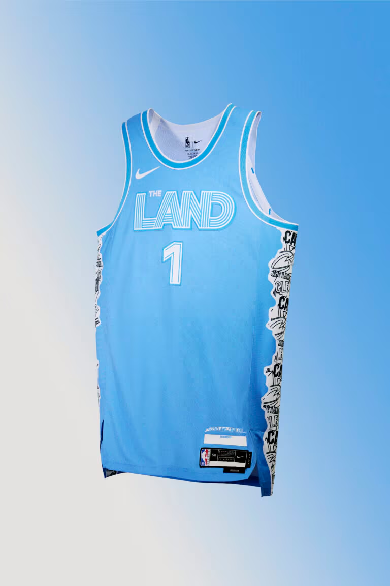
I like these, even though I will not immediately spot this color and go “Cavs” in my brain. Part of why these will work is their court that goes with them is phenomenal.
7. Phoenix Suns
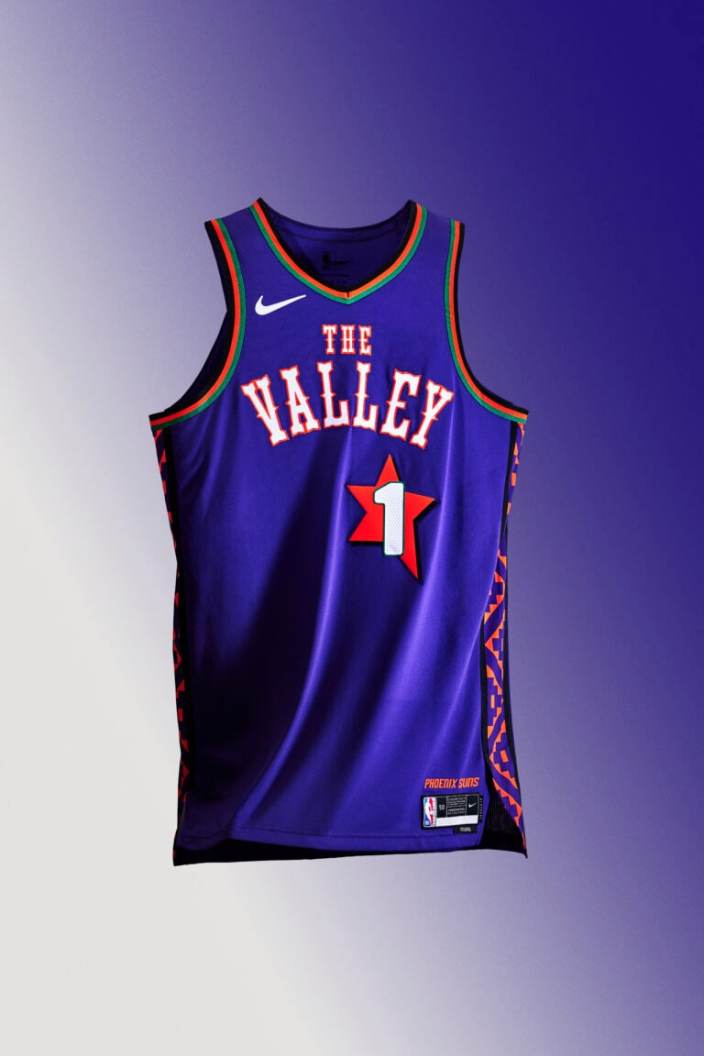
Another one that gets a big boost from an unbelievably good court design. These play off the old 1995 All-Star logo, and while I’m not crazy about the font, I still dig them. If they incorporated the saguaro cactus into them, they’d be higher.
Very Good Uniforms
6. Portland Trail Blazers
The Blazers almost always do a good job with the City edition uni, and this year is another good addition to their rotation. A big part of that is their “Rip City” font just looks good on anything.
5. Utah Jazz
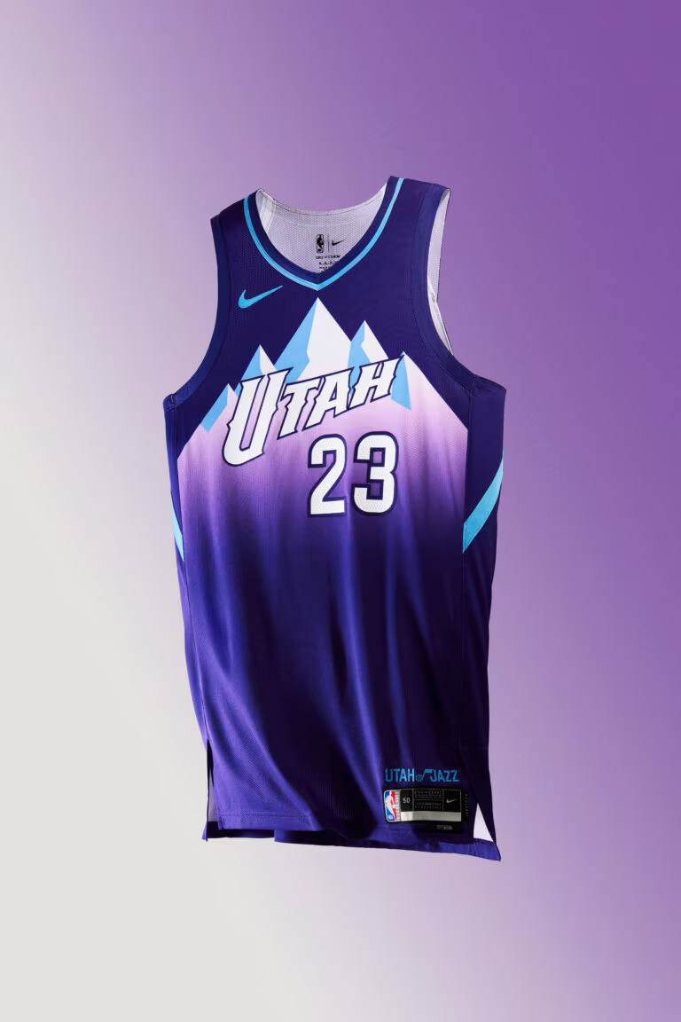
The Jazz are finally making the move back to the purple mountains with their full-time uniform set, and this year’s City Edition is a very good version of that.
4. Memphis Grizzlies
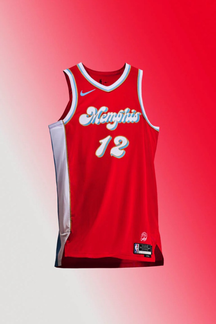
The throwback to the Memphis Sounds just looks fantastic. I love that Memphis font and these are going to look fantastic on the floor — even if it’ll take a little adjustment to seeing a team in red and thinking “Grizzlies”.
3. Sacramento Kings

The Kings also have another really good throwback look, taking it to the days of the Cincinnati Royals. The royal blue and red just pops, and they didn’t try to do too much with a uniform that doesn’t need much more.
2. Philadelphia 76ers
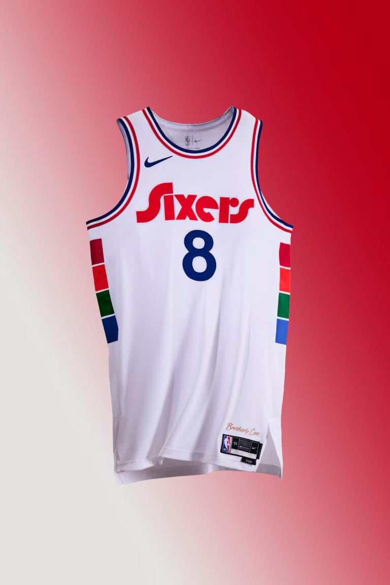
I’m a sucker for this spectrum Sixers look. I just think it’s so clean and the white edition is even better than the navy look from a couple years back.
Make It The Permanent Logo
1. Toronto Raptors
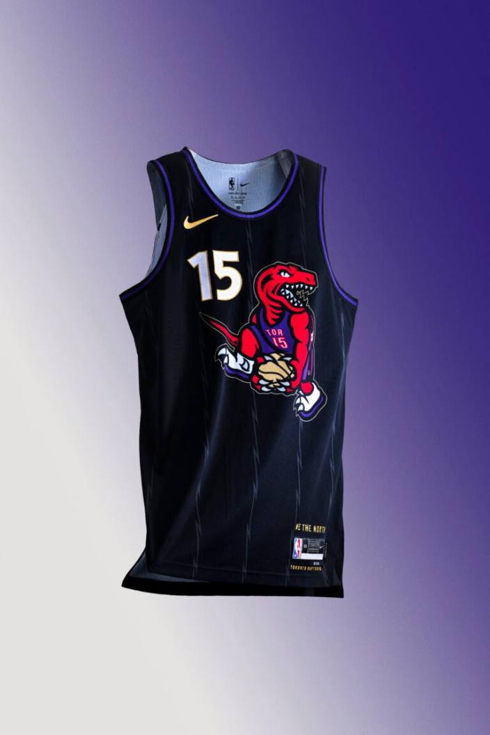
The Vince Carter Raptor doing his legendary between-the-legs dunk is so good and the Raptors need to just make it their permanent logo. These with the purple retro look they brought back this year is a damn-near perfect uniform set and it’s a shame they will move on to something new next season.
