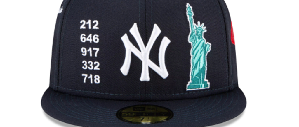
Alright, listen. These hats, the new line of “Local Market” hats that will be released for Major League Baseball teams, you gotta see them, folks. They are not particularly good. The lede ends here, let’s dive in.
Nope pic.twitter.com/Er6uwFAcvL
— Matt Williams (@MattWi77iams) May 25, 2021
The Rays play in St. Petersburg, not Tampa. The Rays “Local Market” cap is emblazoned with the Tampa area code (St. Pete’s is 727) and a reference to Cigar City, which is… Tampa. pic.twitter.com/0YjVnG6W3u
— Timothy Burke (@bubbaprog) May 25, 2021
Man this #Dodgers hat and the rest of the local market hats are a little much. @UniWatch pic.twitter.com/DfZhsrfKg7
— Jonathan Hoffman (@JHoff100) May 25, 2021
Hmmmmmmmmmmmm pic.twitter.com/AxdzWnwpcU
— Lindsey Adler (@lindseyadler) May 25, 2021
What are we doing here?
There is a lot going on with some of these local market hats but I think my favorite detail is the range in area code representation—7 different ones for the Twins, 8 for the Cubs, 9 for the Braves, and *zero* for the Pirates??? pic.twitter.com/G0kKXp5TE3
— Emma Baccellieri (@emmabaccellieri) May 25, 2021
My favorite detail about these ugly local market hats? They used the same 1776 patch on both the Phillies and Nats hats. It makes sense for Philly, but no sense for DC since it wasn’t established as the capitol until 1790. pic.twitter.com/W7SOplMIMD
— Liz Roscher (@lizroscher) May 25, 2021
THE POE ON THE BACK AHAHAHAHAHA pic.twitter.com/K9cvGqWTiq
— Jordan Mountkatzle (@NaturallyKatz11) May 25, 2021
Should I buy The Worst Hat Ever Made? pic.twitter.com/a7I9KiPPoX
— Tom Fornelli (@TomFornelli) May 25, 2021
What are we DOING HERE?
they really put a PEROGI on the back of Cleveland’s “local market” hat I’m screaming
(h/t @MikeReedUSN) pic.twitter.com/D6M9iTyhFc
— Jordan Zirm (@JordanZirm) May 25, 2021
COME ON.
Here is the thing with Major League Baseball hats: The ones that are usually the best are the ones that do not try to do too terrible much — think of the classic Yankees hat, or the blue and red Cubs hat, or the Red Sox hat that are just a base color and a big letter B. Most times that we get these kinds of unique releases, it ends up taking something good and adding way too much to it, either by doing some weird pattern design (an example!) or by adding so much unnecessary stuff that it takes away from what makes the hats great.
These are just a lot — I, a Yankee fan, do not need to own a hat that has a slice of pizza and a boombox on it — and if there is a silver lining, it’s that there appears to be a sense of solidarity in how uniformly strange all of these are. Well, that, and this seems like a pretty fun way to learn about area codes for teams in other markets.
