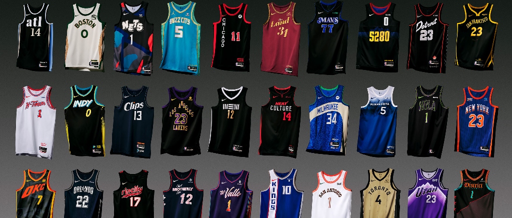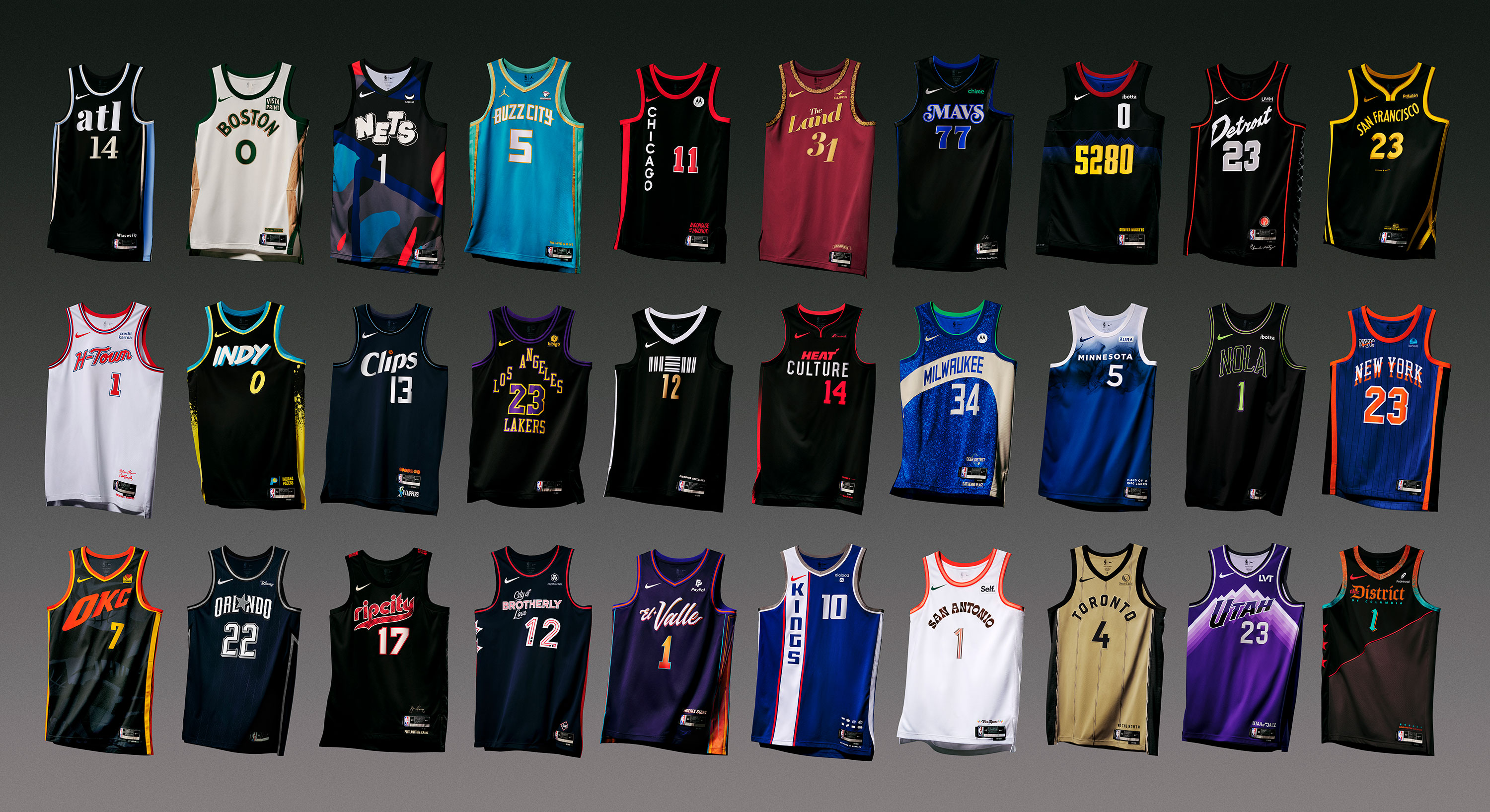
On Thursday morning, the NBA and Nike officially unveiled the 30 City Edition uniforms that each team will wear during the 2023-24 season, marking the eighth season of the locally inspired alternate uni set.
The 2023-24 Nike NBA City Edition uniforms are HERE – which represent the stories, history and heritage that make each franchise unique – honoring the inherent bond between, court, community and culture.
SHOP NOW
https://t.co/ESXgztkQ8e pic.twitter.com/gUpxRk6CCf
— NBA (@NBA) November 2, 2023
The official unveiling came a week-plus after the full set leaked online, and the fan response was not particularly good. As is always the case, when you see them on players and in professional photos, rather than low resolution leaks, they all look a bit better, but plenty of them still miss the mark. What began as a fun idea to be creative with a unique, local spin on a team’s image has become an almost dreaded part of the early season, as eight years in, the well of great uniform ideas has run a bit dry.
That’s unfortunate because there is a story and a lot of thought behind each one, with various details tucked inside each design that have a deeper meaning to the team or the city, whether it be fonts, trim, or other little detail points. However, at this point it feels like Nike and the NBA have gotten lost in those little details and hiding Easter eggs on the uniforms and forgotten what is most important in creating a beloved uniform.
Small details can enhance a uniform, but what matters is how it looks from afar. That’s how we consume them for the most part, by watching teams run up and down the court from a distance, whether you’re in the arena or watching on TV. As such, what matter most is how they pop in a macro sense, with the colors, logos, and graphics you can see from afar.
This year’s City Edition set is particularly drab, as more than half feature a mostly black, charcoal, or navy base, with limited pops of color. Individually, many of them are fine, but when shown as a set, they seem particularly uninspiring.

Beyond that, City Edition unis can get cluttered by swapping out city and team names for longer slogans or choosing fonts and numbers with weird kerning that are hard to recognize from a distance. Basketball uniforms aren’t meant to be viewed in a static sense, and a lot of this year’s City Edition unis miss the mark on the big picture.
That’s not always been the case, as there have been some truly beloved uniforms that have come from the City Edition line over the years. Miami’s “Vice” uniforms are the gold standard, and I still think they should have just become their permanent set. Phoenix’s “The Valley” and Utah’s gradient uniforms were so good they petitioned the league successfully to keep them around for multiple years — with the Suns running back the Valley theme again this year with a twist, and, unsurprisingly, they’re among the best.
What all of those have in common is that they managed to strike the balance between understanding what makes a jersey pop when zoomed out while also connecting to the local flavor of the city with a great story. As a group, almost all of this year’s uniforms hit on the latter point (although, I’d understand if you think the Heat uniform might just be mailing it in) but very few seem to remember the former.
The result has been a tepid response, at best, from most fan bases, and if the league and Nike are going to continue this, they’d do well to get back to basics a bit more going forward.
